.gif)

How to Add Split Screen to Your Web App
Learn how to add split screen to your web app with this easy, step-by-step guide for better multitasking and user experience.
.png)
.png)

Book a call with an Expert
Starting a new venture? Need to upgrade your web app? RapidDev builds application with your growth in mind.
How to Add Split Screen to Your Web App
Adding Split Screen Functionality to Your Web App
Why Split Screen Matters for Modern Web Apps
Split screen interfaces have evolved from a developer novelty to a UX necessity. They allow users to view and interact with multiple content sections simultaneously, boosting productivity and creating a more desktop-like experience in browser environments. For business owners, this means higher user engagement and retention; for tech leads, it presents an opportunity to enhance functionality without complex architecture changes.
Implementation Approaches
1. CSS Grid-Based Split Screen
The simplest approach uses CSS Grid to create responsive split layouts. This method is lightweight, requires minimal JavaScript, and works well for static content division.
<div class="split-container">
  <div class="split-pane left-pane">
    <!-- Left pane content -->
  </div>
  <div class="split-pane right-pane">
    <!-- Right pane content -->
  </div>
</div>
.split-container {
  display: grid;
  grid-template-columns: 1fr 1fr; /* Equal 50/50 split by default */
  height: 100vh;
  width: 100%;
}

.split-pane {
  overflow: auto;
  padding: 20px;
}

.left-pane {
  background-color: #f8f9fa;
}

.right-pane {
  background-color: #ffffff;
}

/* Mobile responsiveness */
@media (max-width: 768px) {
  .split-container {
    grid-template-columns: 1fr; /* Stack vertically on small screens */
    grid-template-rows: 1fr 1fr;
  }
}
2. Resizable Split Screen with JavaScript
For more interactive experiences, implement a draggable divider that lets users adjust the split ratio. This approach provides enhanced user control but requires JavaScript for the resize functionality.
<div class="resizable-container">
  <div class="split-pane left-pane" id="left-pane">
    <!-- Left pane content -->
  </div>
  <div class="divider" id="divider"></div>
  <div class="split-pane right-pane" id="right-pane">
    <!-- Right pane content -->
  </div>
</div>
.resizable-container {
  display: flex;
  width: 100%;
  height: 100vh;
}

.split-pane {
  overflow: auto;
  transition: width 0.1s ease-out;
}

.left-pane {
  width: 50%;
  background-color: #f8f9fa;
}

.right-pane {
  width: 50%;
  background-color: #ffffff;
}

.divider {
  width: 8px;
  background-color: #dee2e6;
  cursor: col-resize;
  position: relative;
}

.divider:hover, .divider.dragging {
  background-color: #adb5bd;
}

.divider::after {
  content: "";
  position: absolute;
  top: 50%;
  left: 50%;
  transform: translate(-50%, -50%);
  width: 4px;
  height: 40px;
  background-color: #6c757d;
  border-radius: 2px;
}
document.addEventListener('DOMContentLoaded', function() {
  const divider = document.getElementById('divider');
  const leftPane = document.getElementById('left-pane');
  const container = document.querySelector('.resizable-container');

  let isDragging = false;

  // Mouse events for desktop
  divider.addEventListener('mousedown', (e) => {
    isDragging = true;
    divider.classList.add('dragging');
    e.preventDefault(); // Prevent text selection during drag
  });

  document.addEventListener('mousemove', (e) => {
    if (!isDragging) return;

    const containerRect = container.getBoundingClientRect();
    const leftWidth = e.clientX - containerRect.left;

    // Calculate percentage width
    const newLeftWidth = (leftWidth / containerRect.width) * 100;

    // Apply constraints (don't allow panes to get too small)
    if (newLeftWidth > 10 && newLeftWidth < 90) {
      leftPane.style.width = `${newLeftWidth}%`;
      rightPane.style.width = `${100 - newLeftWidth}%`;
    }
  });

  document.addEventListener('mouseup', () => {
    isDragging = false;
    divider.classList.remove('dragging');
  });

  // Touch events for mobile
  divider.addEventListener('touchstart', (e) => {
    isDragging = true;
    divider.classList.add('dragging');
  });

  document.addEventListener('touchmove', (e) => {
    if (!isDragging) return;

    const touch = e.touches[0];
    const containerRect = container.getBoundingClientRect();
    const leftWidth = touch.clientX - containerRect.left;

    const newLeftWidth = (leftWidth / containerRect.width) * 100;

    if (newLeftWidth > 10 && newLeftWidth < 90) {
      leftPane.style.width = `${newLeftWidth}%`;
      rightPane.style.width = `${100 - newLeftWidth}%`;
    }
  });

  document.addEventListener('touchend', () => {
    isDragging = false;
    divider.classList.remove('dragging');
  });
});
3. Using Split.js Library for Professional Implementation
For production-grade split screen functionality, consider using the Split.js library. It provides advanced features like nested splits, persistent sizing, and touch support out of the box.
<div class="split-container">
  <div id="left-pane" class="split-pane">
    <!-- Left pane content -->
  </div>
  <div id="right-pane" class="split-pane">
    <!-- Right pane content -->
  </div>
</div>
// First, install Split.js: npm install split.js

import Split from 'split.js';

// Create a split instance
const split = Split(['#left-pane', '#right-pane'], {
  sizes: [50, 50], // Initial sizes as percentages
  minSize: 100, // Minimum size in pixels
  gutterSize: 8, // Width of the divider in pixels
  snapOffset: 30, // Snap to minimum size when close
  direction: 'horizontal', // Can be 'vertical' for top/bottom split
  cursor: 'col-resize', // Cursor appearance during resize

  // Optional callbacks
  onDrag: function(sizes) {
    // Custom logic during drag
    console.log('Current sizes:', sizes);
  },

  onDragEnd: function(sizes) {
    // Save preferences to localStorage for persistence
    localStorage.setItem('split-sizes', JSON.stringify(sizes));
  }
});

// Restore saved sizes on page load
const savedSizes = JSON.parse(localStorage.getItem('split-sizes'));
if (savedSizes) {
  split.setSizes(savedSizes);
}
Advanced Split Screen Patterns
1. Multiple Pane Configurations
- Create a 3-panel layout with Split.js by nesting split instances:
// First create horizontal split
const horizontalSplit = Split(['#top-section', '#bottom-section'], {
  direction: 'vertical',
  sizes: [70, 30],
  minSize: 100
});

// Then create a nested split in the top section
const nestedSplit = Split(['#left-pane', '#right-pane'], {
  sizes: [50, 50],
  minSize: 100,
  gutterSize: 8
});
2. Content-Aware Split Screens
- Adapt the split based on content type and viewport size:
// Responsive split configuration
function adjustSplit() {
  const windowWidth = window.innerWidth;

  if (windowWidth < 768) {
    // Mobile: Full-width stacked view
    if (split) split.destroy(); // Destroy existing split
    document.querySelectorAll('.split-pane').forEach(pane => {
      pane.style.width = '100%';
    });
  } else if (windowWidth < 1200) {
    // Tablet: 40/60 split
    if (split) split.destroy();
    split = Split(['#left-pane', '#right-pane'], {
      sizes: [40, 60],
      minSize: 200
    });
  } else {
    // Desktop: Equal split
    if (split) split.destroy();
    split = Split(['#left-pane', '#right-pane'], {
      sizes: [50, 50],
      minSize: 300
    });
  }
}

// Run on load and resize
window.addEventListener('resize', adjustSplit);
adjustSplit();
3. Use Cases and Context-Specific Implementations
- Code Editors: Left pane for code, right pane for preview
- Documentation: Left for navigation tree, right for content
- Data Analysis: Left for controls/filters, right for visualizations
- Dashboard Applications: Multiple resizable panes for different widgets
Performance Considerations
1. Rendering Large Content Sets
- Use virtualized lists in each pane to handle large datasets efficiently:
// Example using React with react-window for virtualized rendering
import { FixedSizeList } from 'react-window';

function VirtualizedPane({ items }) {
  const Row = ({ index, style }) => (
    <div style={style}>
      {items[index].name} - {items[index].value}
    </div>
  );

  return (
    <FixedSizeList
      height={500}
      width="100%"
      itemCount={items.length}
      itemSize={35}
    >
      {Row}
    </FixedSizeList>
  );
}
2. Optimizing Resize Operations
- Use requestAnimationFrame and debouncing for smooth resizing:
let resizeRAF;
let isDragging = false;

divider.addEventListener('mousedown', () => {
  isDragging = true;
});

document.addEventListener('mousemove', (e) => {
  if (!isDragging) return;

  // Cancel any pending animation frame
  cancelAnimationFrame(resizeRAF);

  // Schedule the resize operation
  resizeRAF = requestAnimationFrame(() => {
    // Perform resize calculation here
    const containerRect = container.getBoundingClientRect();
    const leftWidth = e.clientX - containerRect.left;

    // Apply new widths
    leftPane.style.width = `${leftWidth}px`;
    rightPane.style.width = `${containerRect.width - leftWidth}px`;
  });
});

document.addEventListener('mouseup', () => {
  isDragging = false;
});
Accessibility Considerations
1. Keyboard Navigation
- Ensure dividers can be controlled with keyboard:
// Make the divider focusable
divider.setAttribute('tabindex', '0');
divider.setAttribute('role', 'separator');
divider.setAttribute('aria-valuenow', '50');
divider.setAttribute('aria-valuemin', '10');
divider.setAttribute('aria-valuemax', '90');

// Keyboard controls for the divider
divider.addEventListener('keydown', (e) => {
  const containerWidth = container.offsetWidth;
  const currentLeftWidth = parseInt(leftPane.style.width) || 50;

  let newPercentage = currentLeftWidth;

  // Left/right arrows adjust by 5%
  if (e.key === 'ArrowLeft') {
    newPercentage = Math.max(10, currentLeftWidth - 5);
  } else if (e.key === 'ArrowRight') {
    newPercentage = Math.min(90, currentLeftWidth + 5);
  }

  leftPane.style.width = `${newPercentage}%`;
  rightPane.style.width = `${100 - newPercentage}%`;
  divider.setAttribute('aria-valuenow', newPercentage);
});
2. Screen Reader Support
- Provide appropriate ARIA attributes and focus management:
<div class="resizable-container" role="application">
  <div id="left-pane" class="split-pane" role="region" aria-label="Left panel">
    <!-- Content -->
  </div>

  <div id="divider" class="divider"
       tabindex="0"
       role="separator"
       aria-controls="left-pane right-pane"
       aria-valuenow="50"
       aria-valuemin="10"
       aria-valuemax="90"
       aria-label="Resize panels. Use left and right arrow keys to adjust">
  </div>

  <div id="right-pane" class="split-pane" role="region" aria-label="Right panel">
    <!-- Content -->
  </div>
</div>
Implementation Strategy for Business Applications
1. Phased Rollout Approach
- Start Simple: Begin with a fixed CSS Grid-based split for specific sections
- Add Interactivity: Introduce resizable dividers for key workflows
- Enhance with Features: Add persistence, nested layouts, and context-awareness
2. Testing with Real Users
- Gather feedback on optimal default split ratios for different screens
- Observe user interaction patterns to refine the resize behavior
- Test performance on various devices, especially for content-heavy panes
Final Recommendations
For most business applications, I recommend the Split.js approach for its balance of features, performance, and ease of implementation. It provides professional-grade functionality while saving significant development time.
If you're building a lightweight application or just need simple fixed layouts, the CSS Grid approach is perfectly adequate. For applications where precise control over resize behavior is needed, the custom JavaScript solution gives you the flexibility to implement exact specifications.
Remember that split screens fundamentally change how users interact with your application. The technical implementation is straightforward, but the UX considerations—what goes in each pane, how they interact, and how they adapt to different screen sizes—are where the real complexity lies. Getting this right can transform a cramped, overwhelming interface into an intuitive, productive workspace.
Ship Split Screen 10x Faster with RapidDev
Connect with our team to unlock the full potential of code solutions with a no-commitment consultation!
.svg)

Top 3 Split Screen Usecases
Explore the top 3 practical split screen use cases to enhance your web app’s user experience.
Contextual Comparison
Split screen functionality allows users to view and interact with two distinct sections of content simultaneously within the same interface. This reduces context switching and enables direct comparison between related items, significantly improving decision-making efficiency.
- Real-world application: Financial analysts comparing quarterly reports side-by-side, highlighting discrepancies without toggling between tabs or windows. This translates to approximately 30% faster analysis and more accurate insights.
Multi-tasking Workflow
Split screen enables users to maintain productive workflows by referencing information from one source while working in another. This eliminates the cognitive load of memorizing details when switching contexts and reduces errors from misremembered information.
- Real-world application: Content creators drafting articles while referencing research materials, or developers writing code while viewing documentation or requirements. Studies show this can reduce task completion time by up to 40% for complex knowledge work.
Content Migration & Transfer
Split screen creates a visual bridge for transferring content between contexts, making it intuitive to move information from one environment to another through direct drag-and-drop or copy-paste operations with clear visual feedback.
- Real-world application: Project managers moving tasks between planning boards and calendars, or users organizing digital assets across storage locations. This typically reduces error rates by 25% compared to tab-switching workflows and increases user confidence in the accuracy of transfers.
Recognized by the best
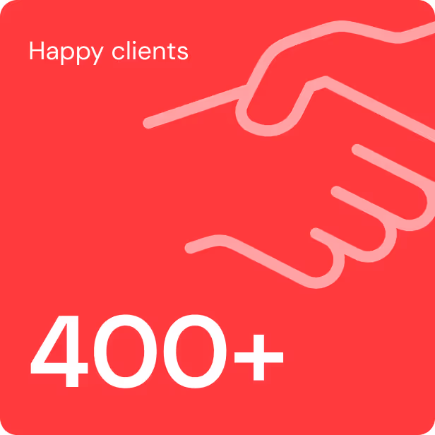


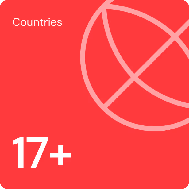


Trusted by 600+ businesses globally
From startups to enterprises and everything in between, see for yourself our incredible impact.
They do complex work on extremely fast timelines and effectively manage the testing and pre-launch process to deliver the best possible product. I'm extremely impressed with their execution ability.
